Dramatic headlines claim the world is hotter than ever, but forget to mention that this temperature is measured with thermometers that have up to 15 times the margin of error as the supposed increase. Does it really matter anyway when Time Magazine claims global warming is affecting our dreams and the answers might lie in our sleep?
It seems the entire world is abuzz with the news that we are experiencing the hottest temperatures ever, busier even than the bees collecting pollen in this final stretch of summer. The headlines are dramatic, some like me might say nauseatingly so. Last week, CNN declared “This month is the planet’s hottest on record by far – and hottest in around 120,000 years, scientists say.” “The heat in July has already been so extreme that it is ‘virtually certain’ this month will break records ‘by a significant margin,’ the European Union’s Copernicus Climate Change Service and the World Meteorological Organization said in a report published [last] Thursday.” The “temperature for the first 23 days of July averaged 16.95 degrees Celsius (62.51 Fahrenheit), well above the previous record of 16.63 degrees Celsius (61.93 Fahrenheit) set in July 2019.” Of course, no one was equipped with a thermometer 120,000 years ago and the actual records only date back to 1940. Still, “it’s almost certain that these temperatures are the warmest the planet has seen in 120,000 years, given what we know from millennia of climate data extracted from tree rings, coral reefs and deep sea sediment cores.” Who knew there were trees over a hundred thousand years old either? And what precisely can a “deep sea sediment core” tell us about the weather in prehistoric Oklahoma? Regardless, the media is also noticing that summer is hot and heat can have negative effects in some cases. “The human toll of the heat is stark. As temperatures have risen above 120 degrees Fahrenheit (50 degrees Celsius) in parts of the US, heat-related deaths have mounted and people are suffering life-threatening burns from falling onto scorching hot ground.” Matters are even worse because this hot July follows a hot June, which was also so by a “substantial margin.” Kim Cobb, a climate scientist at Brown University, described these studies as “eye-popping,” and warned it was likely to get worse. “It is scary to remember that in another decade, this will be viewed as a relatively cool year, most likely,” she said, adding, “if people don’t like what they’re seeing this summer, they will be in for quite a shock at the higher warming levels we’re heading for.” One wonders if CNN will follow up with her a decade from now when this proves to be yet another claim that doesn’t come to fruition, but if anything, the comments from politicians are even more nauseating. “The era of global warming has ended; the era of global boiling has arrived,” United Nations Secretary-General António Guterres said last week at a speech at UN headquarters in New York last Thursday.
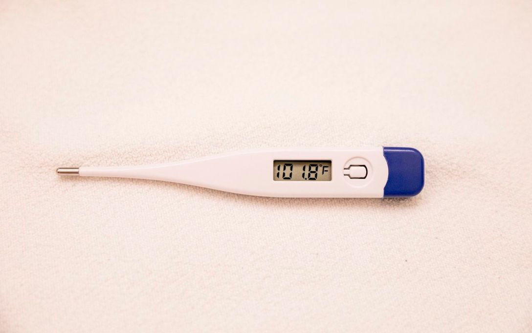
At the risk of sounding like a retrograde climate skeptic, more fit to be behind bars than writing this post, there are a couple of issues with these reports and similar hysterics. First, they fail to acknowledge that a 2022 analysis found a whopping 96% of climate data in the United States is corrupted, primarily because the placement of the thermometers to gather this data does not conform to the very standards the same climate scientists who issue hyperventilating reports on the data have established. In fact, only 4% of thermometers are properly situated in locations that do not generate additional heat while the rest are subject to high margins of error. The (much maligned in climate circles) Heartland Institute determined this by using the government’s own guidelines to rate monitoring stations. These stations are organized into classes. Class 1 is considered optimal with no “artificial heating or reflecting surfaces…within 100 meters.” Class 2 allows heat sources “within thirty meters” and “no shading when the sun elevation is greater than three degrees.” Class 3, however, allows for an error greater than or equal to one degree Celsius with thermometers a mere 10 meters from “heating sources.” Class 4 increases the error to two degrees, and allows sources within 10 meters. Class 5, however, allows a whopping five degrees of error and the thermometer can be located “next to / above an artificial heading source, such as a building, roof top, parking lot, or concrete surface.” Based on this criteria, a previous study from the Heartland Institute found that 89% of stations were unacceptable according to the government’s own standards in 2009. Subsequent studies on the impact of these corrupted sites on the temperature record determined that the placement of thermometers had a huge impact on the perceived warming trend. Class 1 and Class 2 thermometers found a .204 Celsius temperature increase per decade. Class 3, 4, and 5 found a .319 increase, a difference of over 56%. The government, however, reported an increase of a whopping .324 degrees, somehow, figure that one out without assuming their goal is to show the most warming possible however they can. An additional controlled experiment in 2019 found similar results. This experiment was conducted in Oak Ridge, TN, where “four instrumented towers [were] placed over grass at increasing distances (4, 30, 50, 124, and 300 m) from a built-up area. Stations were aligned in such a way to simulate the impact of small-scale encroachment on temperature observations. As expected, temperature observations were warmest for the site closest to the built-up environment with an average temperature difference of 0.31 and 0.24 °C for aspirated and unaspirated sensors respectively. Mean aspirated temperature differences were greater during the evening (0.47 °C) than day (0.16 °C)…These results suggest that small-scale urban encroachment within 50 meters of a station can have important impacts on daily temperature extrema (maximum and minimum) with the magnitude of these differences dependent upon prevailing environmental conditions and sensing technology.”
Incredibly, the situation has only gotten worse since the initial analysis in 2009. As of last year, only two of 128 sites were found to be Class 1 and three were found to be Class 2, meaning that only four stations actually generate reliable temperatures that does not need to be manipulated for accuracy. The remaining stations distort temperatures by up to five degrees, an incredible 15.6 times the supposedly huge increase in temperature we are experiencing, meaning it is impossible by definition to observe gradations this small with this large a potential discrepancy, worse than trying to accurately measure something an inch long with a foot long ruler with no markings. It gets even worse when you consider that at least some of these monitoring stations appear to have been placed to intentionally increased the temperature. “Several examples of station siting that could be categorized as ‘absurd’ were noted during the survey. These include a GHCN station at Lava Hot Springs, Idaho—a tourist site at which the MMTS sensor was placed into a natural hole in the ground where hot water for bathing and swimming emanates from the ground; a WWTP in Ft. Pierce, Florida—where the MMTS was placed in proximity to a road, a building, and near the warm exhausts of five air conditioning units for WWTP offices; and a station in Virginia City, Nevada—at which the MMTS was not only missing its protective cap, but also placed near asphalt, generators, and air conditioning unit exhausts. Perhaps the most absurd was a USHCN station in Colfax, California, which was recently moved due to a modernization upgrade at the California fire station where it is located. The new station has been placed directly above a 20-foot rock wall that absorbs a massive amount of solar energy during the day, and releases it as LWIR at night, with heated air rising to the sensor.” Otherwise, as it was almost fourteen years ago, “Many climate monitoring stations were located next to exhaust fans of air conditioning units, surrounded by asphalt parking lots and roads, located on blistering-hot rooftops, or placed near sidewalks and buildings that absorb and radiate heat.” Putting this another way, they are measuring the temperature of the planet from inside the oven. It’s the same as putting your oven on the broiler setting, standing right next to it, and claiming your house is too hot.
The second challenge is more subtle, but no less insidious. Scientists and the government at large responded to the initial 2009 study and other concerns about the quality of temperature data by insisting that “statistical manipulation could account for and correct the siting problems observed at each station.” Ultimately, the data set from the original network, known as USHCN, was replaced with a new set, “nClimDiv” in 2014. This new collection of temperatures “contains all of the poorly sited USHCN stations, in addition to thousands of other stations that likely have the same set of station siting problems. NOAA / NCDC claims they then ‘adjust’ the nClimDiv data to closely match the data from the USCRN. This ‘Band-Aid’ approach does little to address problems that have been identified, and instead creates a dataset rife with multitudes of adjustments that may or may not fairly represent long-term temperature trends. Moreover, this approach does not address problems with individual station records, such as heat sink effects and biased temperature readings.” The result is so-called scientists making these over-hyped claims based on at least two different data sets with different ill-defined manipulations applied to each, little actual respect for the real temperatures observed at high quality stations, and then a complete and total reconstruction of everything that occurred before 1940. As the Heartland Institute found, “This means all of the temperature data showing climate warming in the 20th century was not adjusted in the same manner as data gathered after 2005, creating a disjointed U.S. climate dataset. Ironically, monthly data from the USCRN…show significantly oscillating temperature changes, with little to indicate a warming trend from 2005 to 2022. In fact, the graphic clearly shows the United States to be cooler in May 2022 compared to January 2005.” Experimental science, of course, does not work like this. In order to be replicable and reliable, a bare minimum requirement is data acquired via a consistent method and implemented in a consistent way. You cannot make measurements on one device, switch to another, claim you can adjust between the two, make these adjustments largely in secret, and then insist your data is reliable to the point where these reports do not mention there could be any issue at all. According to the media, these numbers are accurate going back to before the written word, but in the real world they have been altered and updated multiple times to the point where the entire record is corrupt.
No one has any reason to trust any of this, nor do we have any particular reason to trust that human caused climate change is to blame even if these numbers were accurate. The precise impact on temperature is difficult to determine, especially in an El Nino year where temperatures are increased by the changes in the jet stream. Scientists insist we’re seeing a higher than expected increase, but that’s only based on their own circular data sets. If we were to use a different set, the increase goes away or could be hidden, as we have seen with the USCRN data mentioned above. It’s easier to illustrate the dogma that everything is caused by humans by referring to another recent report that Antarctic sea ice is shrinking. Last week CNN reported that “Antarctic sea ice has fallen to unprecedented lows for this time of year.” How low? Supposedly the lowest since we started studying the ice 45 years ago. “In mid-July, Antarctica’s sea ice was 2.6 million square kilometers (1 million square miles) below the 1981 to 2010 average. That is an area nearly as large as Argentina or the combined areas of Texas, California, New Mexico, Arizona, Nevada, Utah, and Colorado.” The declining ice has led some scientists to claim “the game has changed.” “There’s no sense talking about the odds of it happening the way the system used to be, it’s clearly telling us that the system has changed,” said Ted Scambost, glaciologist at the University of Colorado Boulder. Needless to say, global warming is what has changed. As CNN put it, while “natural climate variability affects the sea ice, many scientists say climate change may be a major driver for the disappearing ice.” “This winter’s unprecedented occurrence may indicate a long-term change for the isolated continent, Scambos said.” He continued, “It is more likely than not that we won’t see the Antarctic system recover the way it did, say, 15 years ago, for a very long period into the future, and possibly ‘ever.’” When you look at the actual data, global warming makes no sense as a root cause, however. The ice is at its lowest level in 45 years, when scientists were telling us the planet was cooling. Since then, while the theory has changed and scientists started insisting the Earth is warming instead, the ice has increased in size dramatically up until very recently. Now, it appears to be shrinking again, but if temperature was the culprit, why would it have increased during the very same four decades that brought on global boiling? While it was increasing, they told us global warming was to blame as well, but when it’s decreasing, global warming is also to blame. What’s the old saying about not having it both ways? In this case, all roads lead to global warming, whatever the direction.
These roads do not even have to be real anymore. According to Time Magazine, global warming’s impact is not confined to the real world. It is even changing the way we dream. “Martha Crawford started having climate change dreams about 11 or 12 years ago. Unlike many of her previously remembered dreams, these were not fragmented or nonsensical—they were ‘very explicit,’ she recalls. ‘They didn’t require a lot of interpretation.’ In one, she’s reading a textbook about climate change and then throws it behind the back of her couch, pretending it doesn’t exist. In another, she’s sitting in a lecture given by a climate scientist. But the professor starts yelling at her for not paying attention, and she fails the course. The meaning was pretty clear, says Crawford, a licensed clinical social worker: ‘You’re not paying attention, and you need to pay attention.’” These dreams prompted Ms. Crawford to start the Climate Dreams Project in 2019, a space “where people can share climate dream anecdotes, mostly anonymously. One dream submitted to the collection was of people digging holes in the desert so that the rising seas would have somewhere to go. In another contribution, a Flood Football game was underway, and in the second half, players were floating on inner-tubes. Another person, who shared four climate dreams, recounted one in which billions of people were funneling into a giant room that looked like a video-game sports arena, but large enough to hold the world’s population. ‘At the end of the dream, the entire face of the earth was different,’ they wrote. ‘It was completely icy and the only habitable part was a giant plateau with a city on it.’” According to Ms. Crawford, climate change has become part of the “fabric of dreaming.” A survey conducted by Time found that a full third of people have experienced climate change inspired dreams, prompting stress, fear, sadness, and anger. This in addition to previous studies suggesting young people cannot deal with the weather. Rather dutifully, if I don’t say so myself, the article continues to note that “dreams can teach us something about how to deal with climate change,” or at least that is the claim of Tore Nielsen, director of the Dreams and Nightmares Laboratory and psychiatry professor at the University of Montreal. “Dreams have, after all, inspired innovations ranging from the sewing machine to the Periodic Table. When it comes to climate change, maybe logical thinking hasn’t been working so well, says Nielsen. Maybe ‘we need more approaches, like a dream-oriented approach.” “Imagine you send out a call for dreamers to dream up solutions to climate change. You’d get probably 10s of 1,000s if not hundreds of 1,000s of replies. A lot of them, obviously [won’t be] very useful,” he suggested. “How many good ideas would it take?”
As if we needed more proof that the entire climate movement lives in fantasy land.
